SILENT VOICE VISIBLE SHAPES
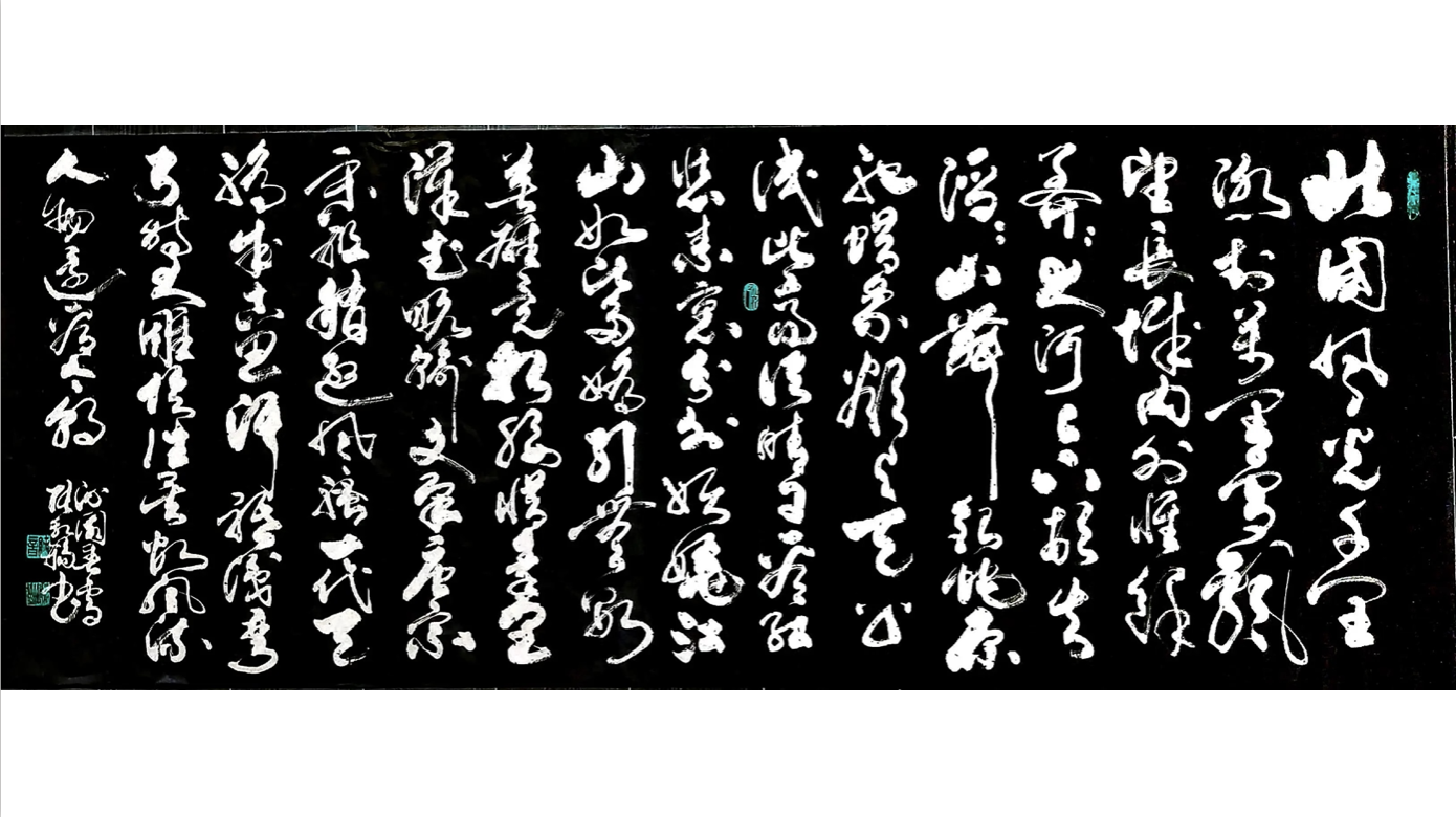
As a graphic designer, I think design inspiration not only comes from some social media or some existing design cases, but also from life. As a designer, I should find more things happening around me. Calligraphy, for example, has a lot of aesthetic principles that graphic design can use for reference. It's not just the brush writing that you see–it has a lot of principles that can inspire designers.
Chinese calligraphy embodies an artistic and philosophical value that can inform and inspire modern typographic design, especially as the two practices merge together. It’s not just about line quality either. For example, when writing Calligraphy, you need to be calm and undistracted in order to create good works. These writing aesthetics and mindset principles are the standard to measure calligraphy and when understood, can better explain the key points needed for a good work. This inspiration motivated me to research and communicate these tools for my audience.
Aesthetic and mindset principles of Chinese Calligraphy
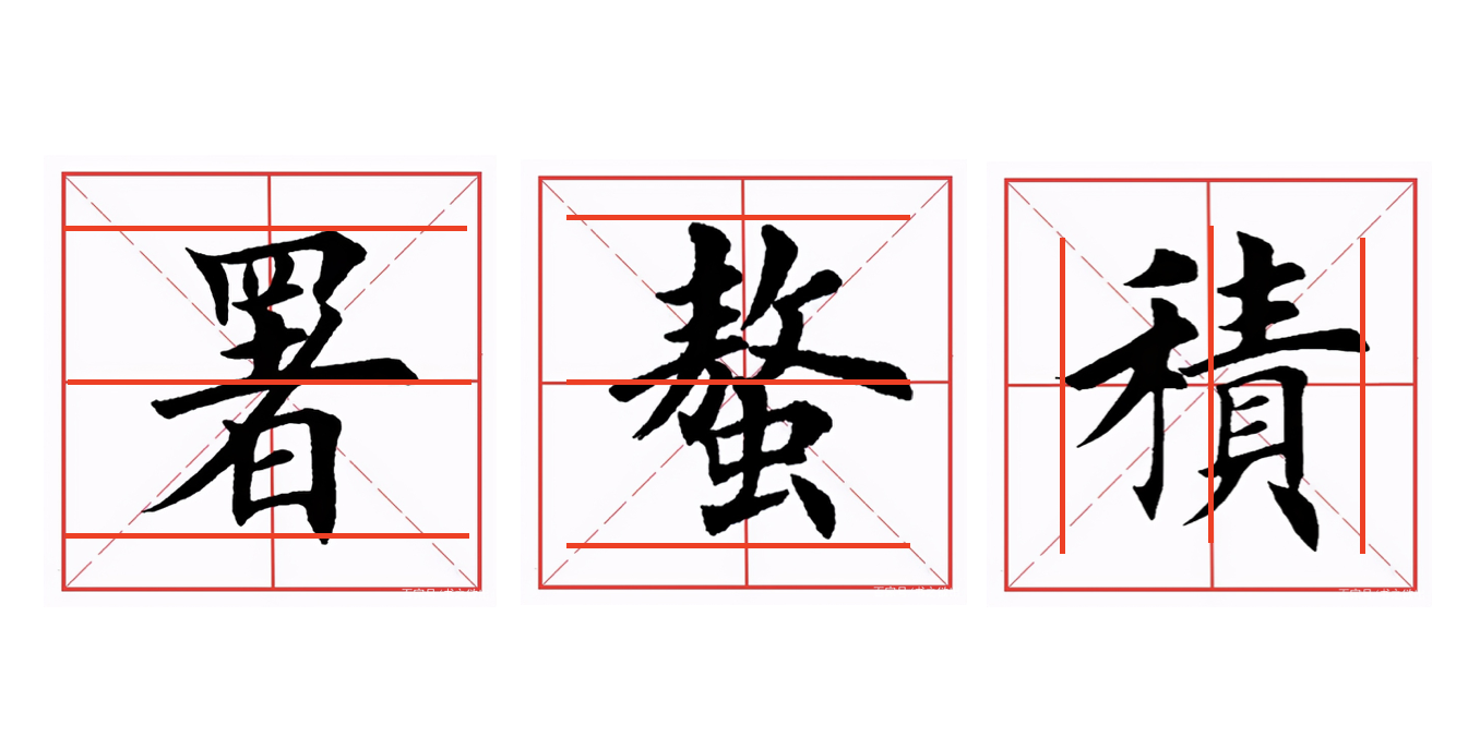
Proportion
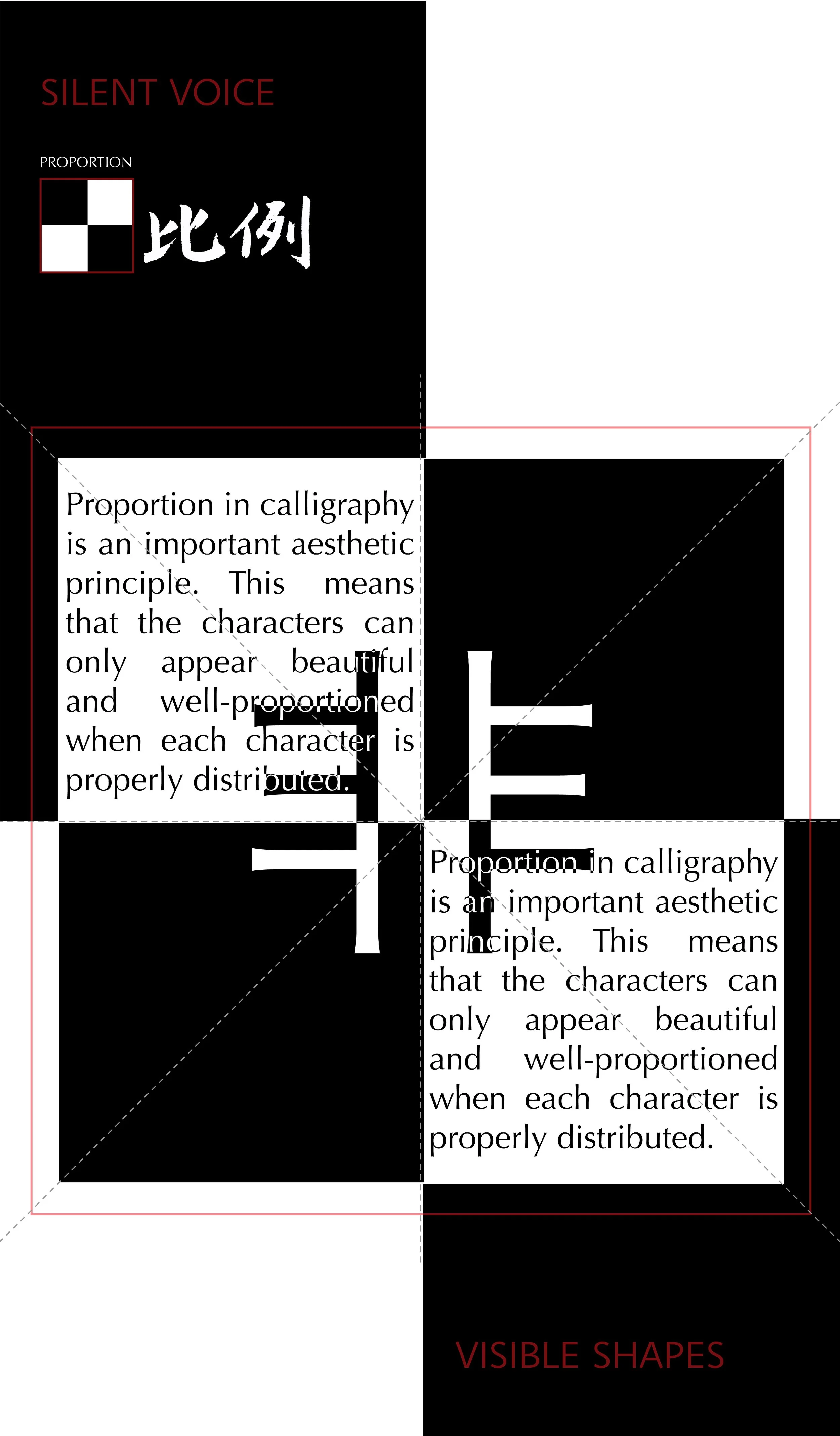
Proportion in calligraphy is an important aesthetic principle. This means that the characters can only appear beautiful and well-proportioned when each character is properly distributed.
Harmony and Contrast:
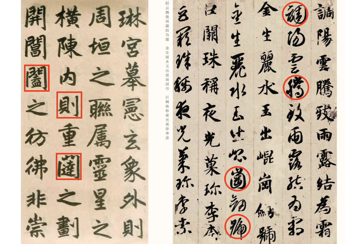
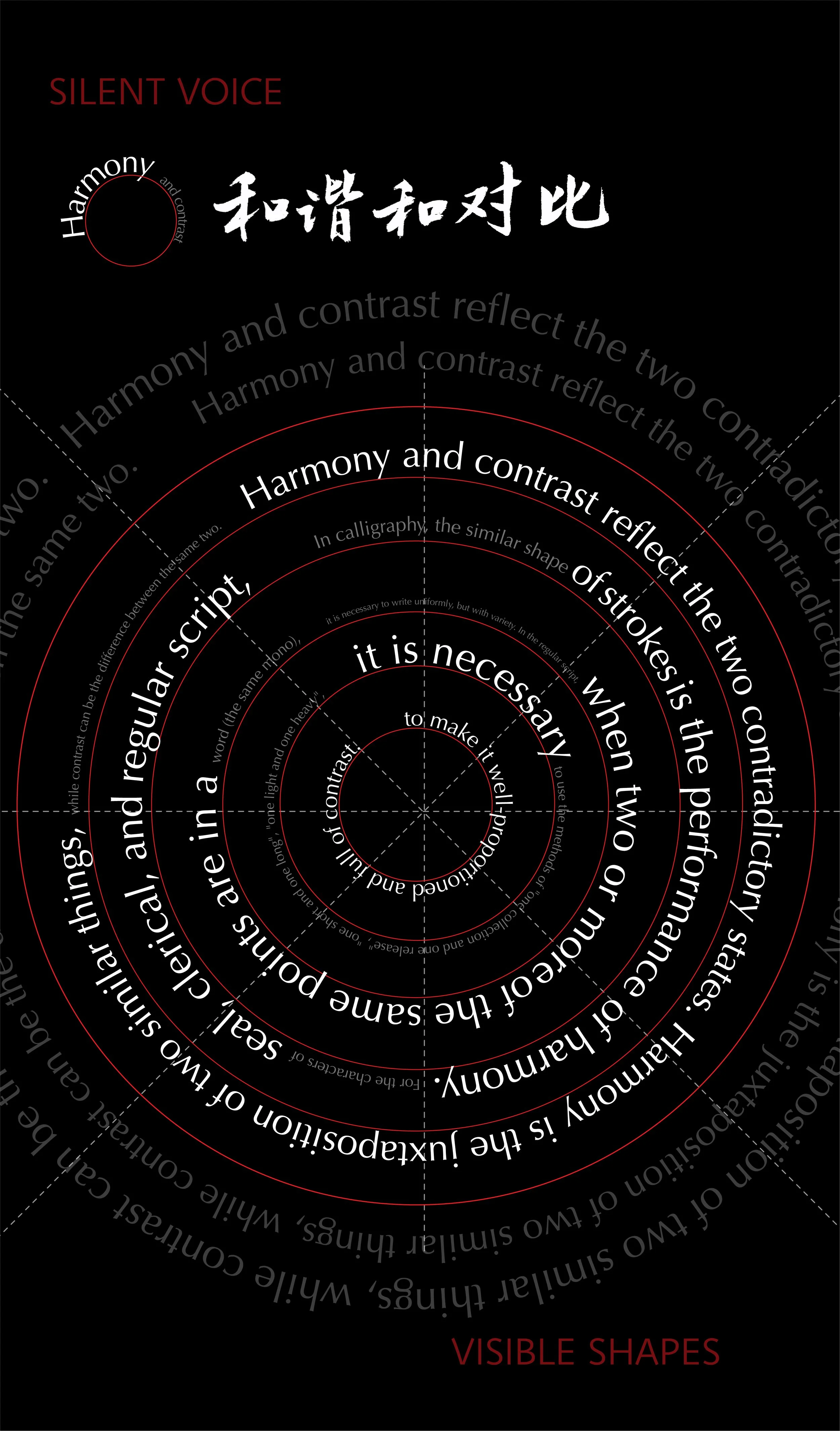
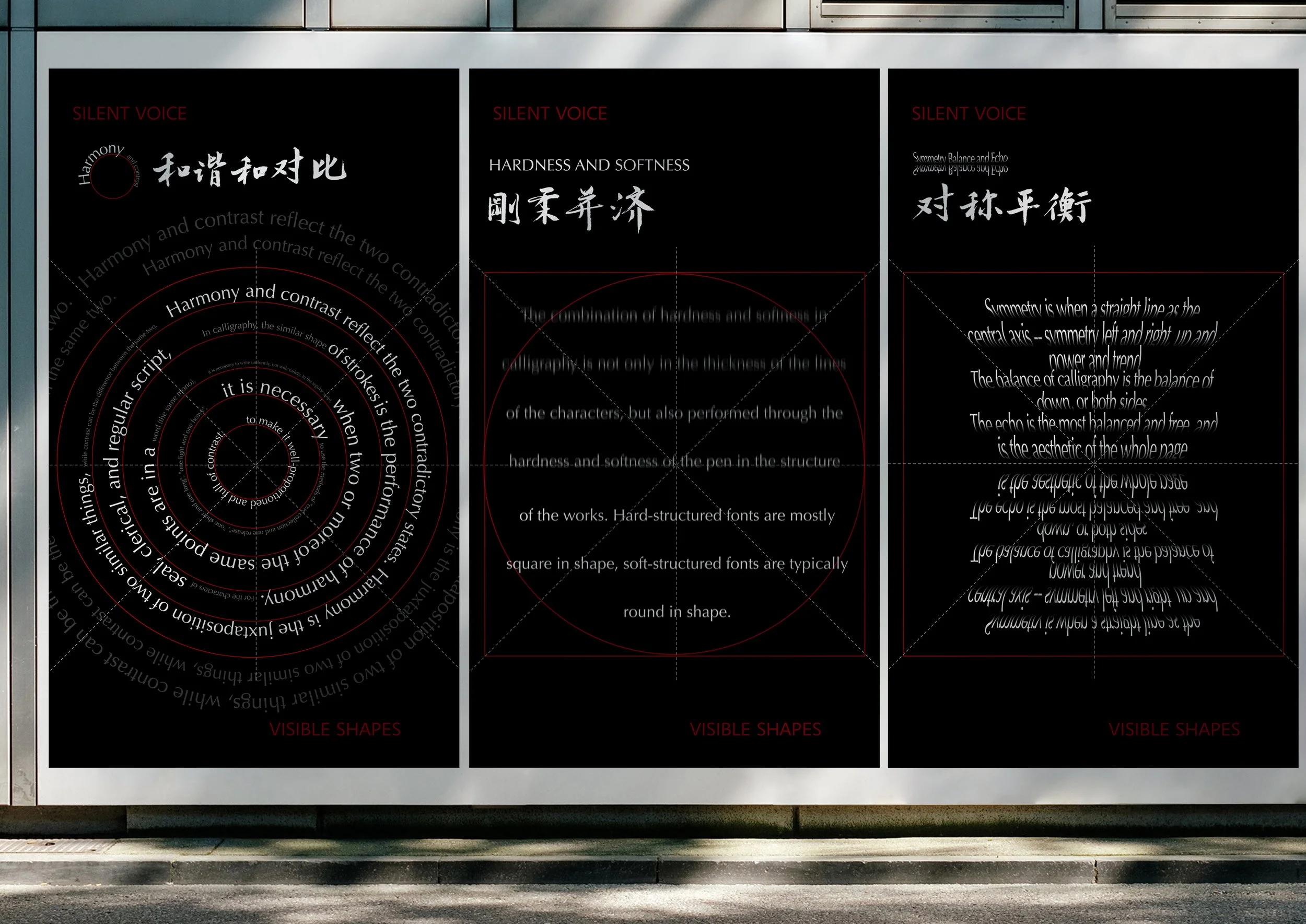
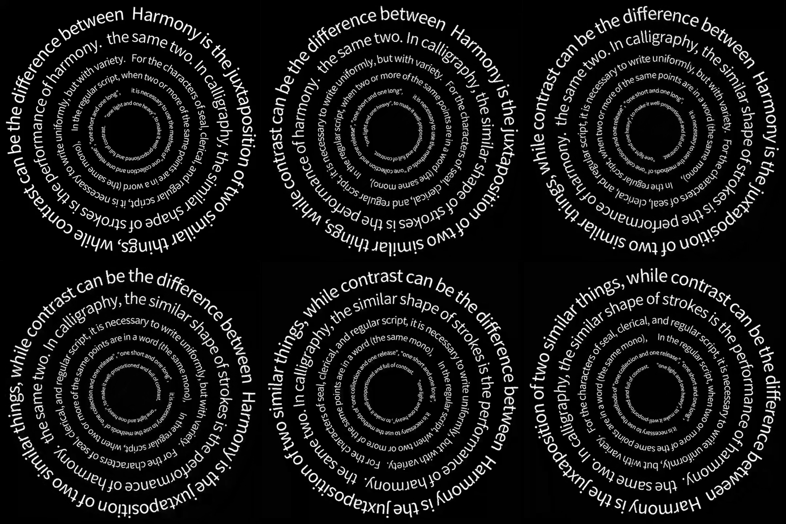
Harmony is the juxtaposition of two similar things, while contrast can be the difference between the same two. In calligraphy, the similar shape of strokes is the performance of harmony. For the characters of seal, clerical, and regular script, it is necessary to write uniformly, but with variety. In the regular script, when two or more of the same points are in a word (the same mono), it is necessary to use the methods of "one collection and one release", "one short and one long", "one light and one heavy", to make it well-proportioned and full of contrast.
Hardness and softness
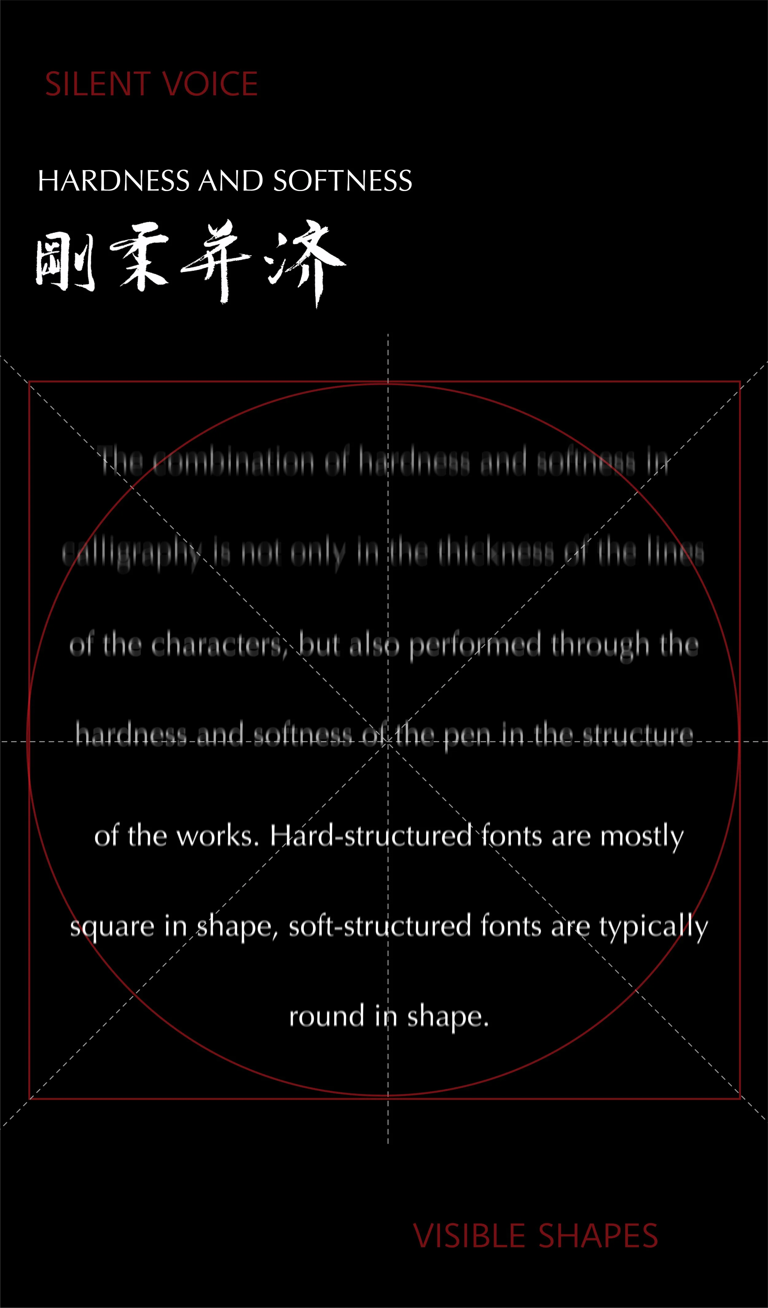
The combination of hardness and softness in calligraphy is not only in the thickness of the lines of the characters, but also performed through the hardness and softness of the pen in the structure of the works. Hard-structured fonts are mostly square in shape, soft-structured fonts are typically round in shape.
Symmetry, Balance and Echo
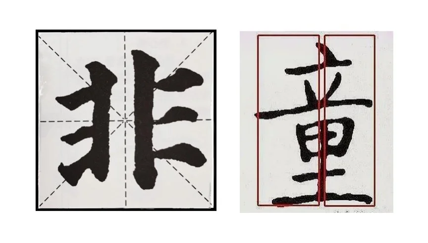
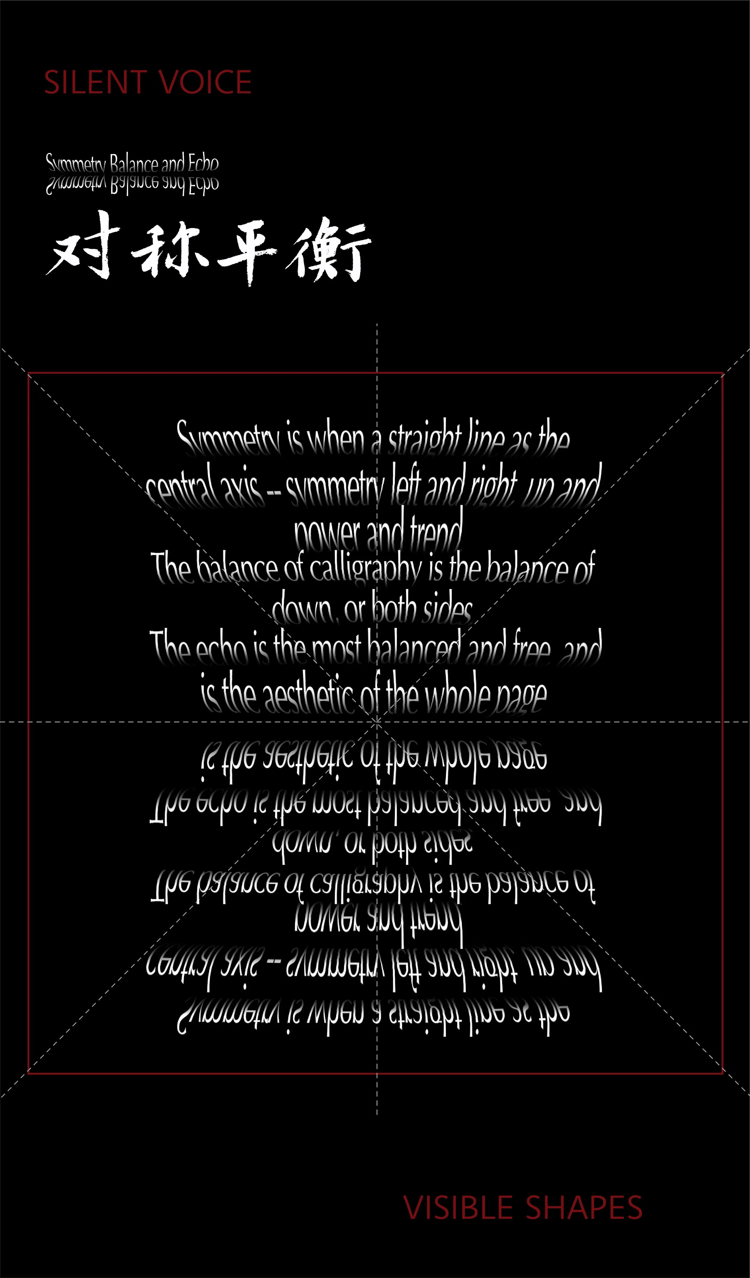
Symmetry refers to a line as the central axis, whether it is left and right, up and down, or both sides of the same, symmetry has quiet, stable characteristics and a clear central focus.
The nature of balance is not necessarily that the two sides of the body must be equal, but that the quantity of values is roughly equal. While balance is a variant of symmetry, balance has more variables - it's more free, and tends to have more of a sense of motion. Balance in calligraphy art is more of a balance of force and trend.
Echo is most balanced and free, it is the gesture in calligraphy points and lines, and the aesthetic of the page as a whole. If there is no echo between the strokes, between the parts of a word, a word falls apart; If there is no echo between the words of a calligraphic work, the work is like a collection of scattered sand.
Pace
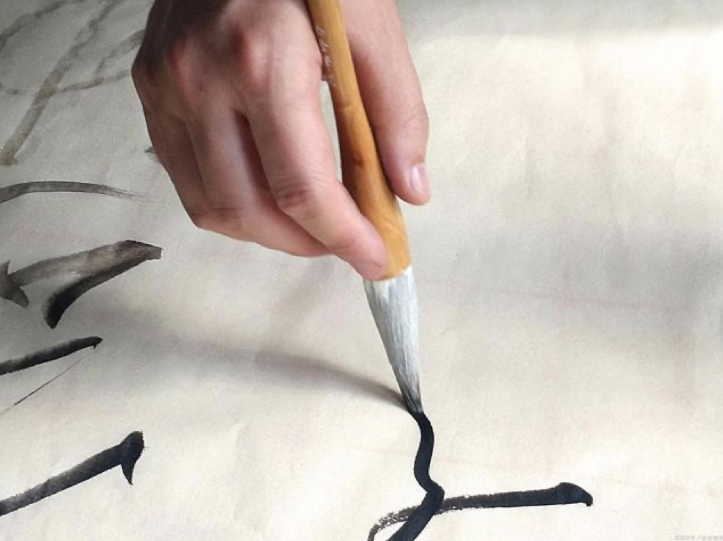
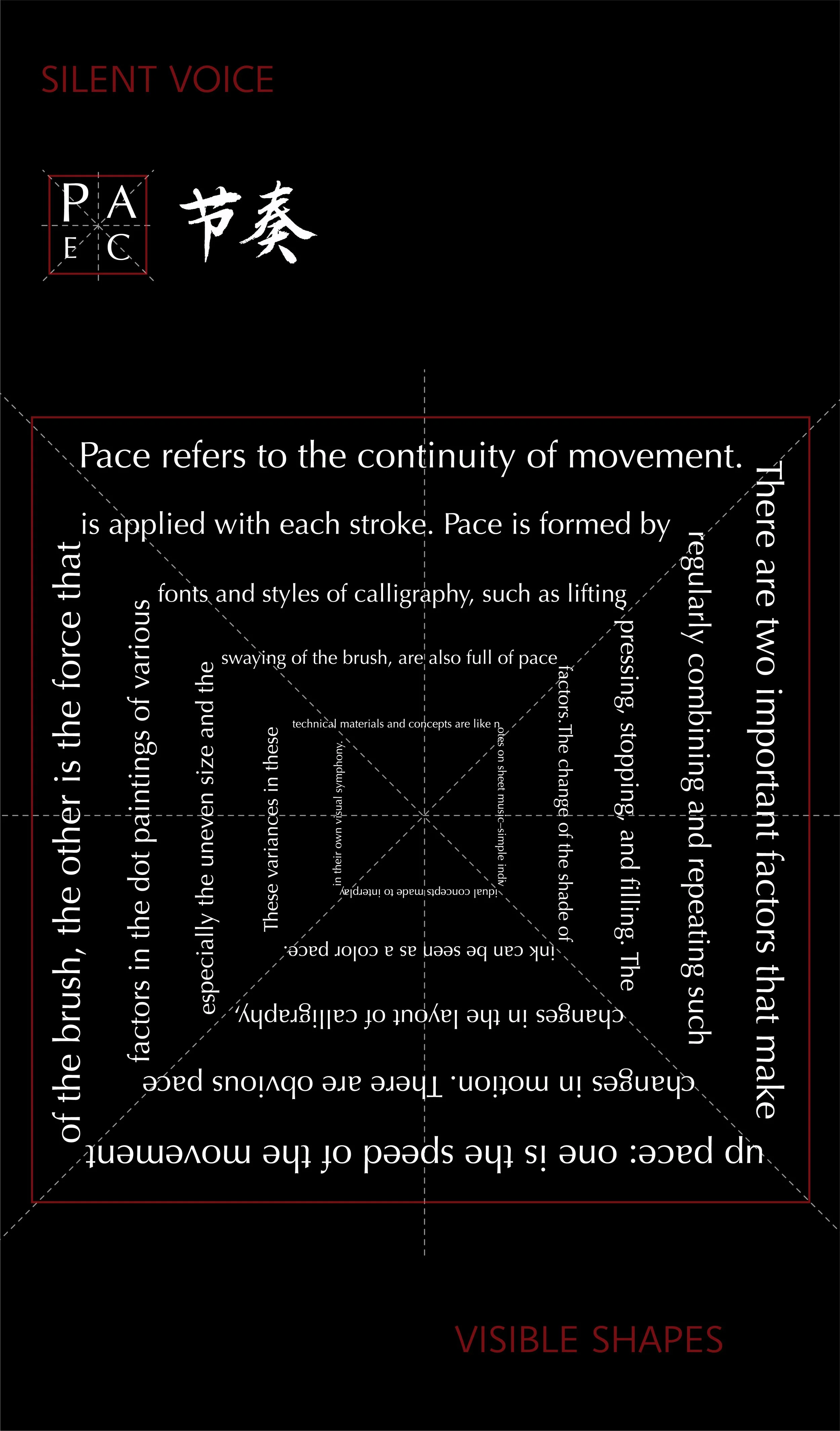
Pace refers to the continuity of movement. There are two important factors that make up pace: one is the speed of the movement of the brush, the other is the force that is applied with each stroke. Pace is formed by regularly combining and repeating such changes in motion. There are obvious pace factors in the dot paintings of various fonts and styles of calligraphy, such as lifting, pressing, stopping, and filing. These variants can be as colorful as the rhythm of music. The change of the shade of ink can be seen as a color pace. In addition, the changes in the layout of calligraphy, especially the uneven size and the swaying of the brush, are also full of pace factors.
Rhythm:
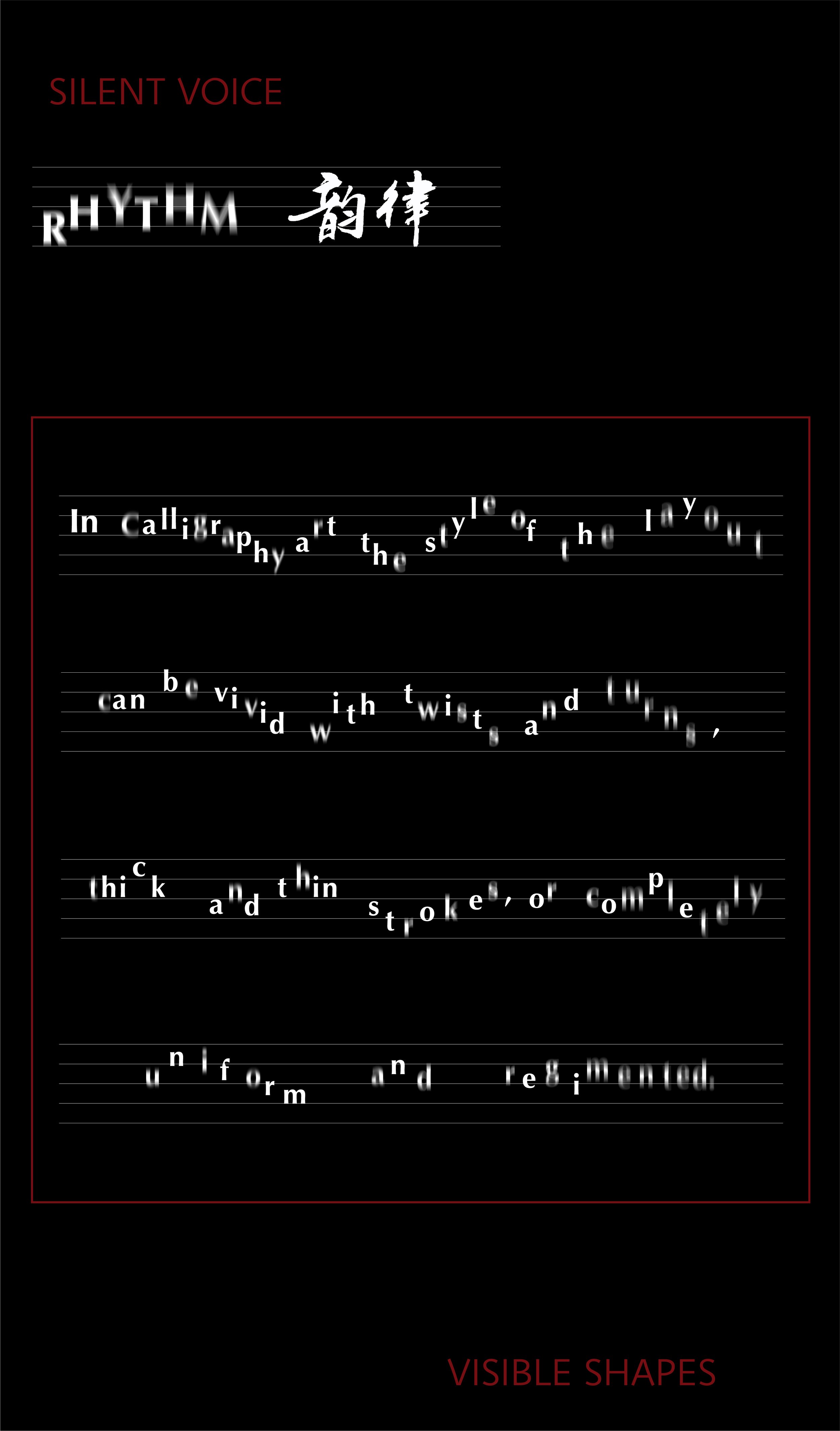
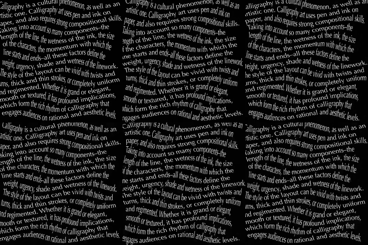
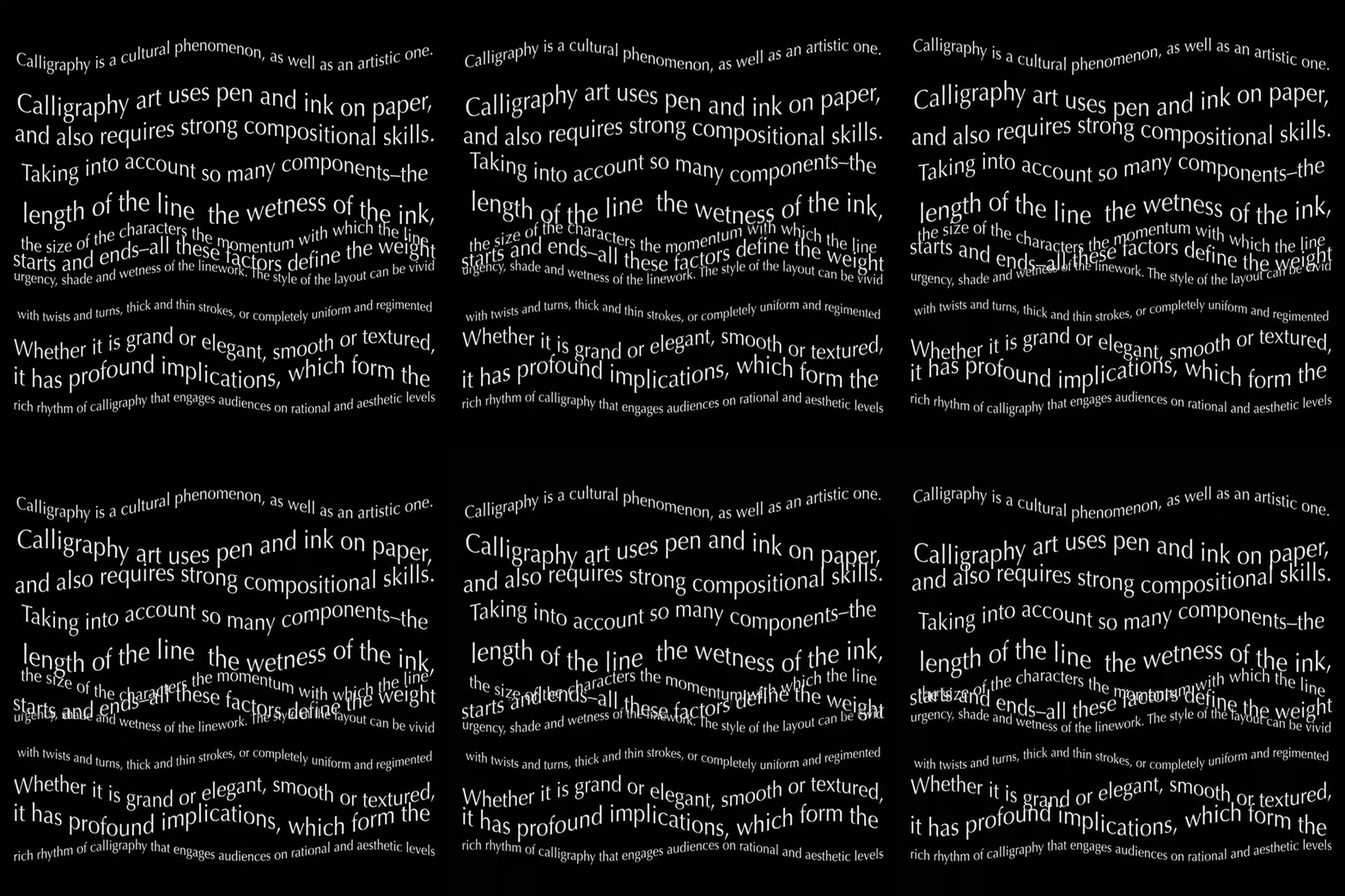
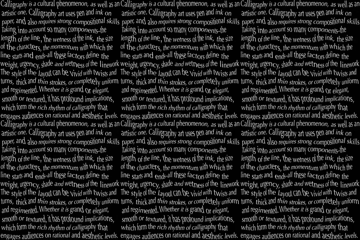
Calligraphy is a cultural phenomenon, as well as an artistic one. Calligraphy art uses pen and ink on paper, and also requires strong compositional skills. Taking into account so many components–the length of the line, the wetness of the ink, the size of the characters, the momentum with which the line starts and ends–all these factors define the weight, urgency, shade and wetness of the linework. The style of the layout can be vivid with twists and turns, thick and thin strokes, or completely uniform and regimented. Whether it is grand or elegant, smooth or textured, it has profound implications, which form the rich rhythm of calligraphy that engages audiences on rational and aesthetic levels.
Mindset principle
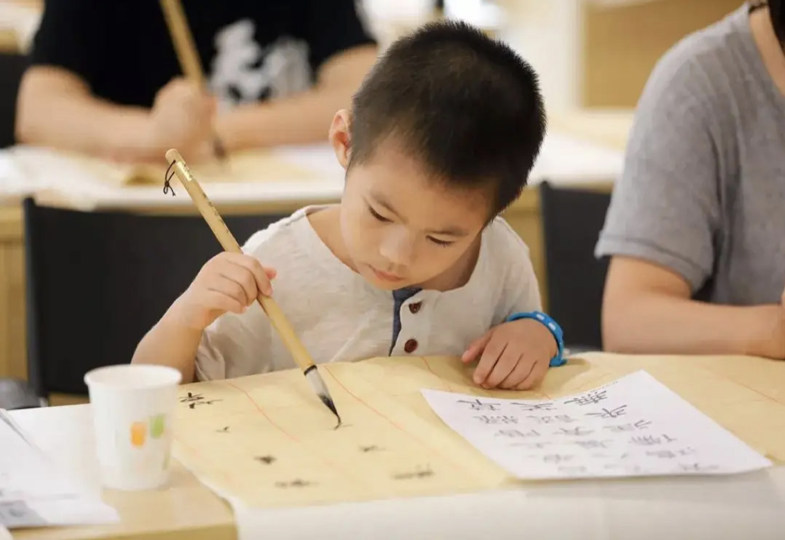
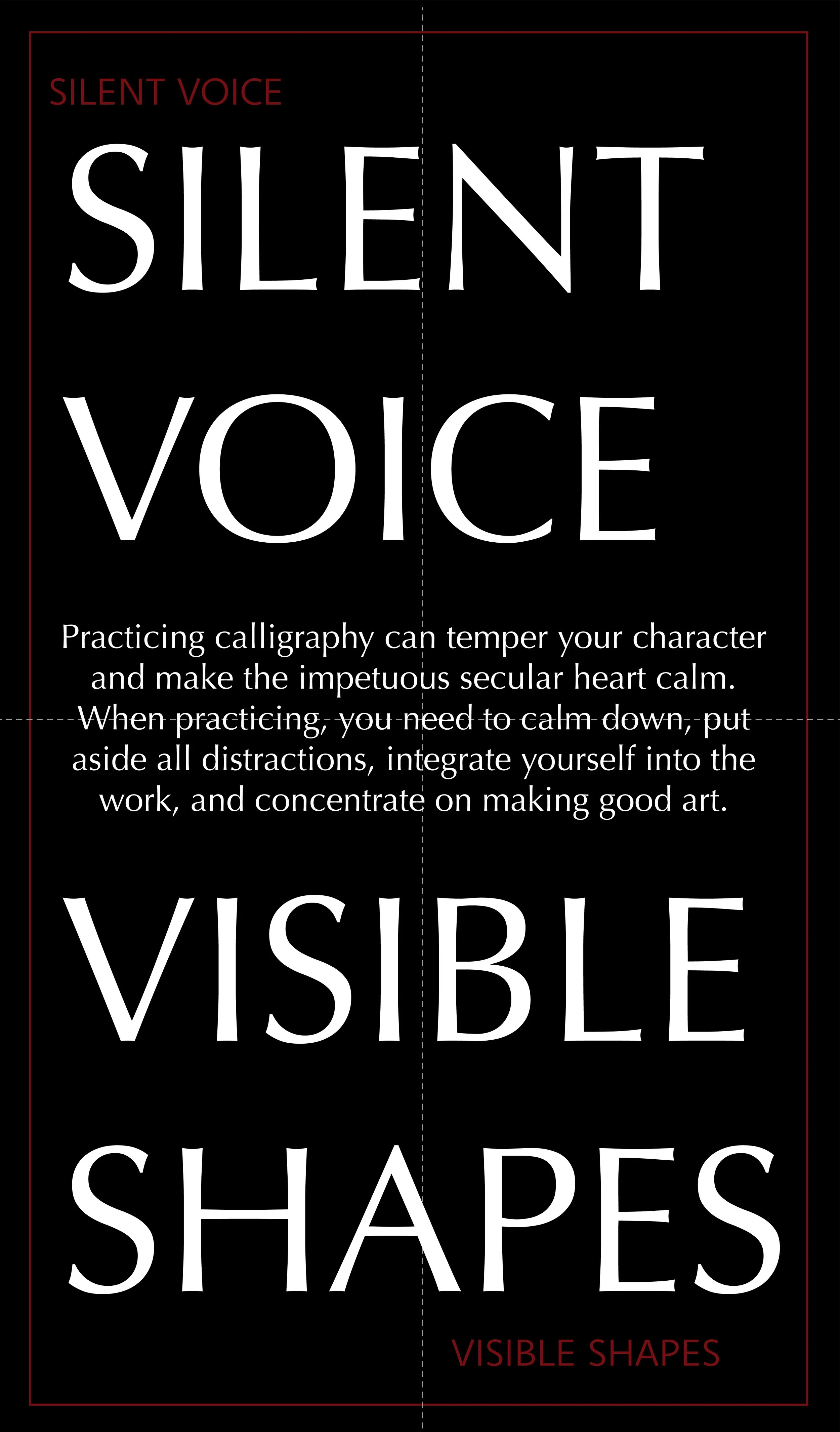
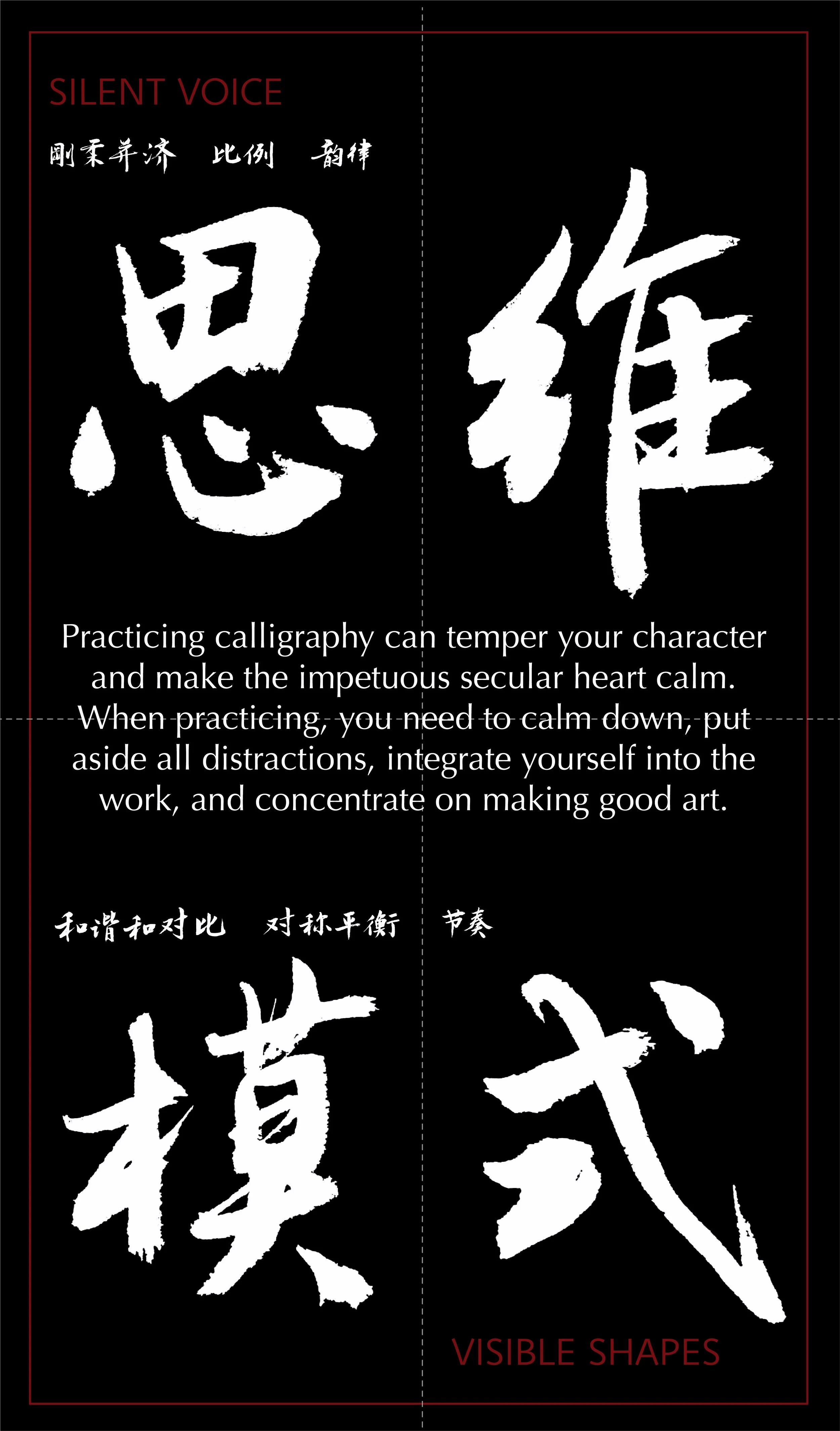
Practicing calligraphy can temper your character and make the impetuous secular heart calm. When practicing, you need to calm down, put aside all distractions, integrate yourself into the work, and concentrate on making good art..
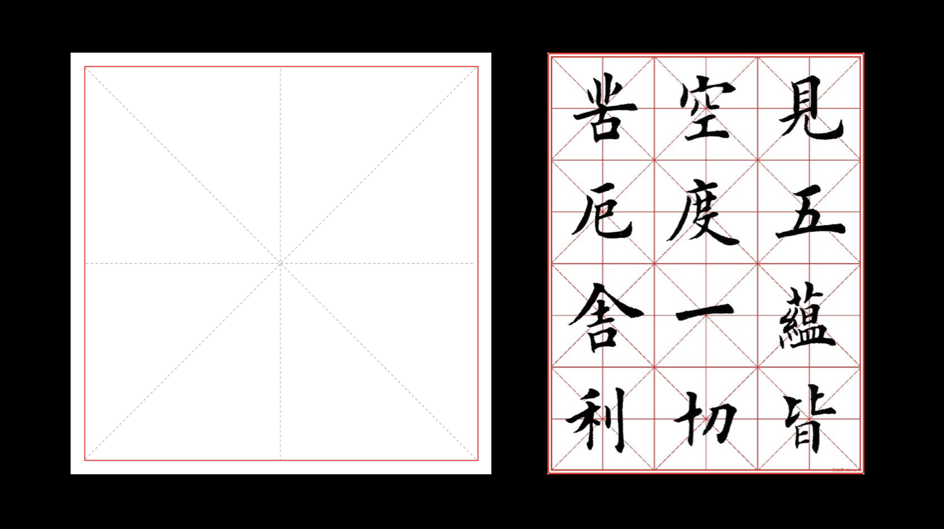
Grid use in Chinese Calligraphy
Grid used as a measure of calligraphy, such as the size of the character, where should it write longer, where should it write shorter
As beginners, they need to use grids to make their writing more formal.
Design Process
Approach:
I set out to produce a series of illustrations/designs/layouts on the principles of calligraphy. Starting out with the assumption that the art form shares commonalities with the world of typefaces, I struggled with deciding how to assign the right font to embody each principle. Consulting with my professor, we developed an effective solution. We figured out that each poster could be presented on a grid, black and white, with text in different arrangements. explaining each principle presented in the design. We took that even further, deciding that Instagram layouts could have even more designs based on calligraphic aesthetic principles.
My studies shown in my poster series and Instagram posts illustrate and explain the principles to Graphic Designers. Serving as a valuable tool for them to discover more possibilities and inspiration, I think these principles can inspire others like myself.
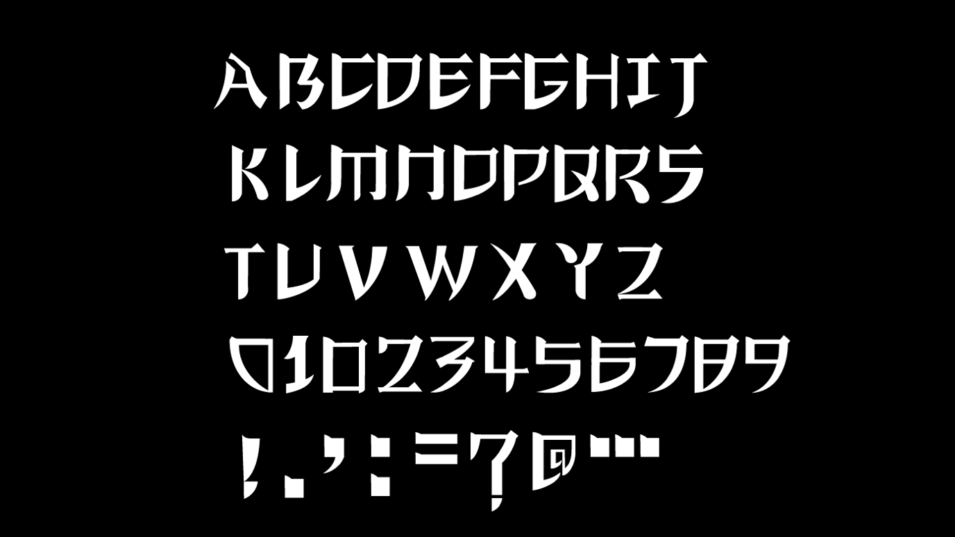
Font design
In the beginning, I’m going to do a set of fonts in the principles of calligraphy, because I think the font and calligraphy art are relatedI'. But then I find it hard to set a single font which embodies all of calligraphy’s principles. So after discussion with my professor, I decided to use calligraphy to communicate each principle of design in a different way to inspire graphic designers.
Poster series
I've created a series of posters and some an ongoing Instagram account, for both traditional browsers and social media/phone layout. Each different poster will be presented by calligraphy grid, black and white text in different arrangements, and the definition of each principle will be presented in the design. Instagram will have more designs based on calligraphic aesthetic principles.
The same aesthetic principles of calligraphy can be applied to motion design
Instagram posts: silent voice_visibleshapes
The main purpose of my thesis is to provide designers with more design inspiration, so I opened an Instagram account, which contains many of my conceptual designs on calligraphy principles, as well as some posters, packaging design and the history of calligraphy development
The definition of this account is : Design inspiration from the enduring principles of Chinese Calligraphy


